
Crafting a Modern Brand: Mama from d Blok
Definition of the Brand and the Problem
When a new brand emerges, regular problems and dilemmas follow. The most challenging one is how to visually communicate your great business idea to the target audience. We had the opportunity to work with the brand Mama from d Blok aimed to represent the essence of a modern, unconventional mother. She combines different elements, thus offering personalized clay products that serve as unique decorations, which can also be used as conversation starters for gatherings with friends and family. The challenge lies in creating a recognizable brand identity that communicates the core activity of crafting clay products while resonating with the target audience.
Strategies and Solutions
The following strategies were taken into action in solving the branding challenge:
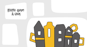
- The development of a distinct and urban visual identity centered around illustrations of the Belgrade buildings, incorporating elements resembling vases, teapots, and cups to reflect the essence of clay products.
- The design of a custom font is characterized by asymmetry and fluidity, mirroring the irregular shapes of clay products to establish a strong connection with the brand’s offerings.
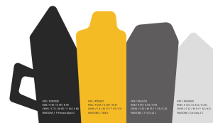
- The implementation of a monochromatic version of the logo for specific applications, ensuring adaptability while maintaining brand integrity.
- The enforcement of consistent usage of guidelines to preserve brand recognition, prohibiting alterations to the logo’s position, font, colors, or proportions.
- The consideration of the readability and visibility of all design elements, adhering to the recommended minimum logo size to ensure clarity and comprehensibility. For the full composition logo, the minimum width should be 96px (34mm), while for the abbreviated logo, it should be 54px (20mm).
Solution and Implementation
The chosen solution involved creating a cohesive brand identity which included a distinct logo, color palette, and typography. The logo composition featured a descending array of illustrations of the buildings in Belgrade, subtly incorporating elements resembling clay products. The color palette consisted of four primary colors: black, two shades of gray, and an energetic yellow, symbolizing optimism, energy, and joy. In addition to this, the selected font, Calibri, a sans-serif typeface designed by Lucas de Groot, was chosen for its rounded edges, simplicity, and readability. Implementation involved strict attachment to branding guidelines across all touchpoints, ensuring consistency in visual communication.
Results
Undoubtedly, the used solution caused positive outcomes, with the brand achieving recognition and resonance within the target market. Quantitative metrics, such as increased brand recall and engagement, together with qualitative feedback, indicated a strong brand association and reflected the success of the branding initiative.
Analysis and Evaluation
Upon analysis, it was evident that the problem of establishing a unique brand identity was effectively addressed through the chosen solution. The defined branding elements, which included the logo composition, color palette, and typography, contributed to brand recognition and differentiation. However, ongoing evaluation revealed areas for clarification, such as the need for periodic updates to maintain relevance in a dynamic market landscape.
Lessons Learned
The case provided valuable insights into the importance of cohesive branding and the role of visual identity in brand perception. Lessons learned from this case could guide similar endeavors, emphasizing the significance of consistency, adaptability, and periodic evaluation in brand management.
Summary of the Case

In conclusion, the case examined the complexity of the process of crafting a modern brand, Mama from d Blok, originating from Serbia, with a unique concept centered around personalized clay products. It followed the brand’s journey from ideation to execution, emphasizing the detailed creation of a visual identity.
Through strategic decisions regarding logo composition, color palette selection and typography, Mama from d Blok successfully established a distinct brand image that resonates with its target audience.
Subsequently, the implementation of the strict branding guidelines ensured consistency across various platforms which also contributed to the increase of the brand’s recognition and engagement. Hence, the case highlights the importance of thoughtful branding strategies in effectively communicating a brand’s message and values to consumers.