Logo Design For The Marketing Agency
1. Client Intro
Adreides is a marketing agency focused on all types of paid advertising on the Internet, such as Google Ads, Facebook Ads, LinkedIn Ads, Amazon Ads, Microsoft Advertising, and other platforms. They came to us with the main request for a logo design.
2. Problem / Goal
The client’s main request was for us to change their visual identity to something more professional and minimal but also with a strong message and effective.
The changes were related to the redesign of the logo and the creation of electronic signatures and memorandums. We also gave the design solutions for advertising and office material – such as business cards, pens, mugs, etc.
3. Solution
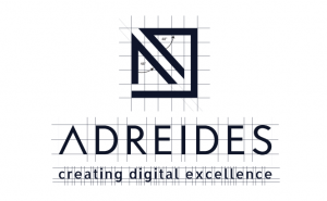
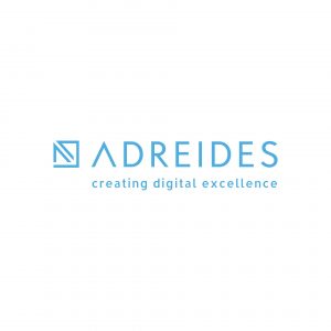
The logo design is clean and minimalistic.
The letters A and D write a square shape around the perimeter. The square form gives the impression of stability and balance. The second symbol is an arrow on the top of the letters, representing growth caused by paid advertising (PPC).
The color palette we used consists of three shades of blue. Dark blue symbolizes strength, integrity, and expertise. Contrasting lighter tones bring an impression of calmness, understanding, and trust.

4. Results
Guided by the business qualities that reflect stability, trust, integrity, professionalism, customer care, progress, and mentoring – we have created a logo design and the entire visual identity of the Adreides brand.
If you are establishing a new business or want to improve the image of an existing one, you are in the right place. Join our satisfied customers and always be one step ahead of the competition.
