Why Is A PPC Landing Page So Important?
What Is A PPC Landing Page?
A pay-per-click landing page is a web page designed to convert traffic from a paid traffic source, such as a Facebook or Google ad. It’s a specific page where people who clicked your ad land.
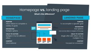
A PPC landing page has one purpose: to persuade visitors to convert – e.g. sign up for a newsletter, register for an event, or buy a product.

Building a dedicated PPC landing page takes a little more time and effort than simply directing your paid traffic to one of your pre-existing web pages. But the benefits of building a custom landing page are always worth the effort.
Higher Conversion Rates Mean More Clicks And Sales
Dedicated landing pages typically yield much higher conversion rates than generic ones. Based on our research of marketers, placing a lead magnet on a custom landing page will generally give in an 8% to 20% conversion rate, compared to just 1% to 3% when placing it on a homepage.
Unlike a ‘regular’ web page, a PPC landing page doesn’t include unrelated distractions, such as a navigation bar or links to other content on the site.
Better Google Ads Quality Score Means More ROI
The quality score is a metric that indicates how your ad quality compares to your competitors for a given keyword. The better your quality score is, the lower your cost-per-click (CPC) will be.
To summarize, an optimized PPC landing page can decrease the fee you pay for each click by giving you a better return on your ad spend.
What do you need to know when you start making a landing page?
When we talk about landing page optimization, there are some important rules we should follow.

1. Send Traffic to the Right Place
Sending paid traffic to a focused and dedicated landing page will increase the chances of getting conversions because the page contains no distractions.
2. Give Visitors A Consistent Experience
Your page has to be like the page they came from – your traffic source, the ad.
3. Strong Headline
The first writing visitors notice when they arrive on your page is the headline. It must intrigue and convince them to stay on the page.
4. Include a Catchy Hero Image
A hero image is the first graphic people see on top of a web page. Because it occupies prime space on the page, it plays a crucial role in drawing visitors to your copy.
As a general rule, avoid stock images. Use custom images instead.
5. Use Benefit-Driven Body Copy
Use brief sentences and paragraphs. Include lots of white space to keep your copy readable.
6. Prioritize Page Speed
According to Google, users are 32% more likely to leave a page when the load time increases from 1 to 3 seconds. You can do this by compressing image files, deleting unused plugins, and reducing redirects.
For more ideas on optimizing your page load time, check out Google’s free PageSpeed Insights tool.
7. Call to Action (CTA button)
CTA button should be action-oriented – it must drive action through verbs. Verbs are energetic and forceful. Work them into your CTA.
8. Testing
Last but not least, a landing page isn’t a set-once-and-forget page. Contrariwise, it is necessary to test it through A/B testing.
A/B testing means comparing two unique versions of a web page to determine which one performs better. Test every element of your page, one at a time: headline, hero image, benefits, CTA.
Add the winning version to the page and move on to the next element. Repeat testing each webpage element until you find the perfect mix that generates the most conversions.

